 |
| There is contrast between the dark background of fifty cent and the light grey background of the hand print . The dark background portrays a sense of a sinister and dangerous side of fifty cent. The lighting does not really outline the features of fifty cents rather focuses on his dress of clothing and props such as his chains which is usually compared to criminals which hints a criminal persona. The white font is really bold which creates an effect on the audience that makes them focus on the white font. His background is empty space which initiates that he is the an important figure since the setting allows the focus to be on him. |
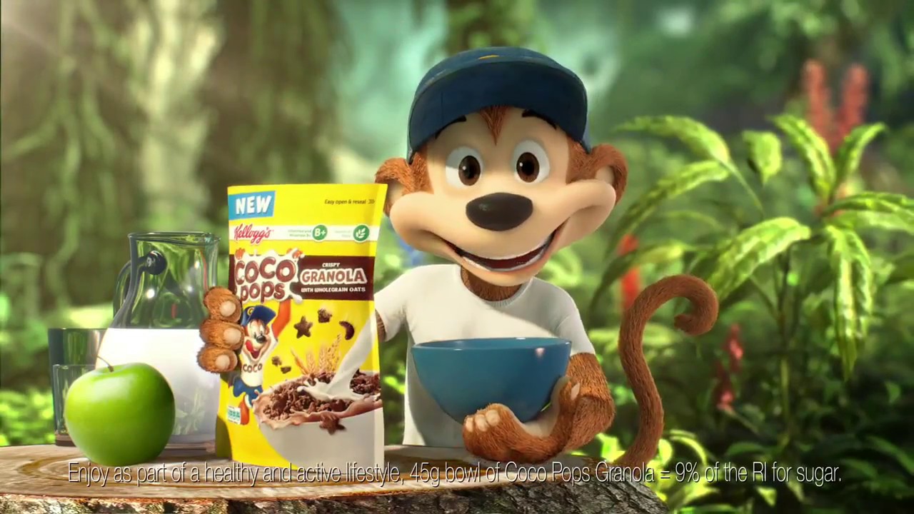
In this coco pops advert , there are many vibrant and bright colours which portrays the positivity of the product.The setting is quite faded whereas the camera focuses on the coco pops box which portrays its importance. The colours are mainly contrasted whereas the coco pops and the monkey are different colours but still contrast with each other. High key lighting is used to define the coco pops and also cast shadows on the background. An apple is purposely put next to it since it compares the healthy fruit to the unhealthy coco pops to target a young audience who will view the coco pops as more appealing than the apple.
No comments:
Post a Comment